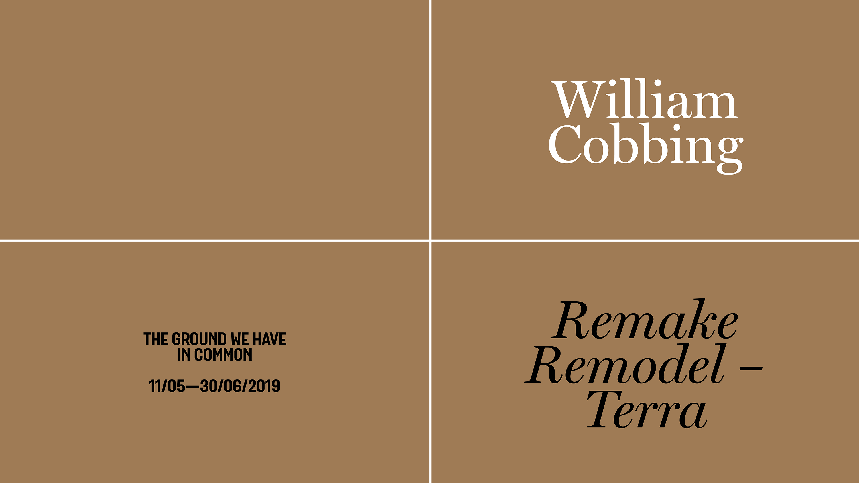
Premio Scarpa 2019
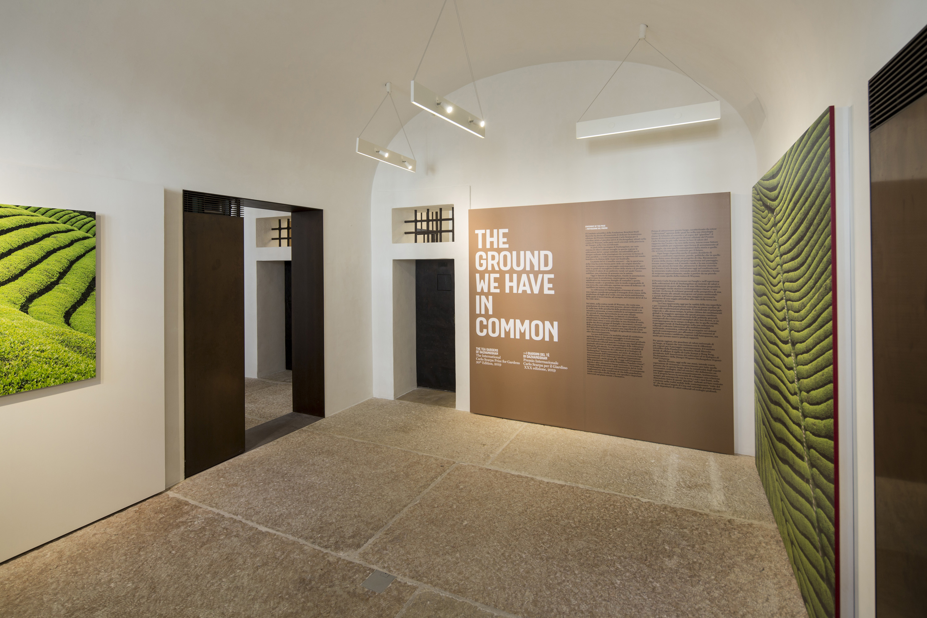
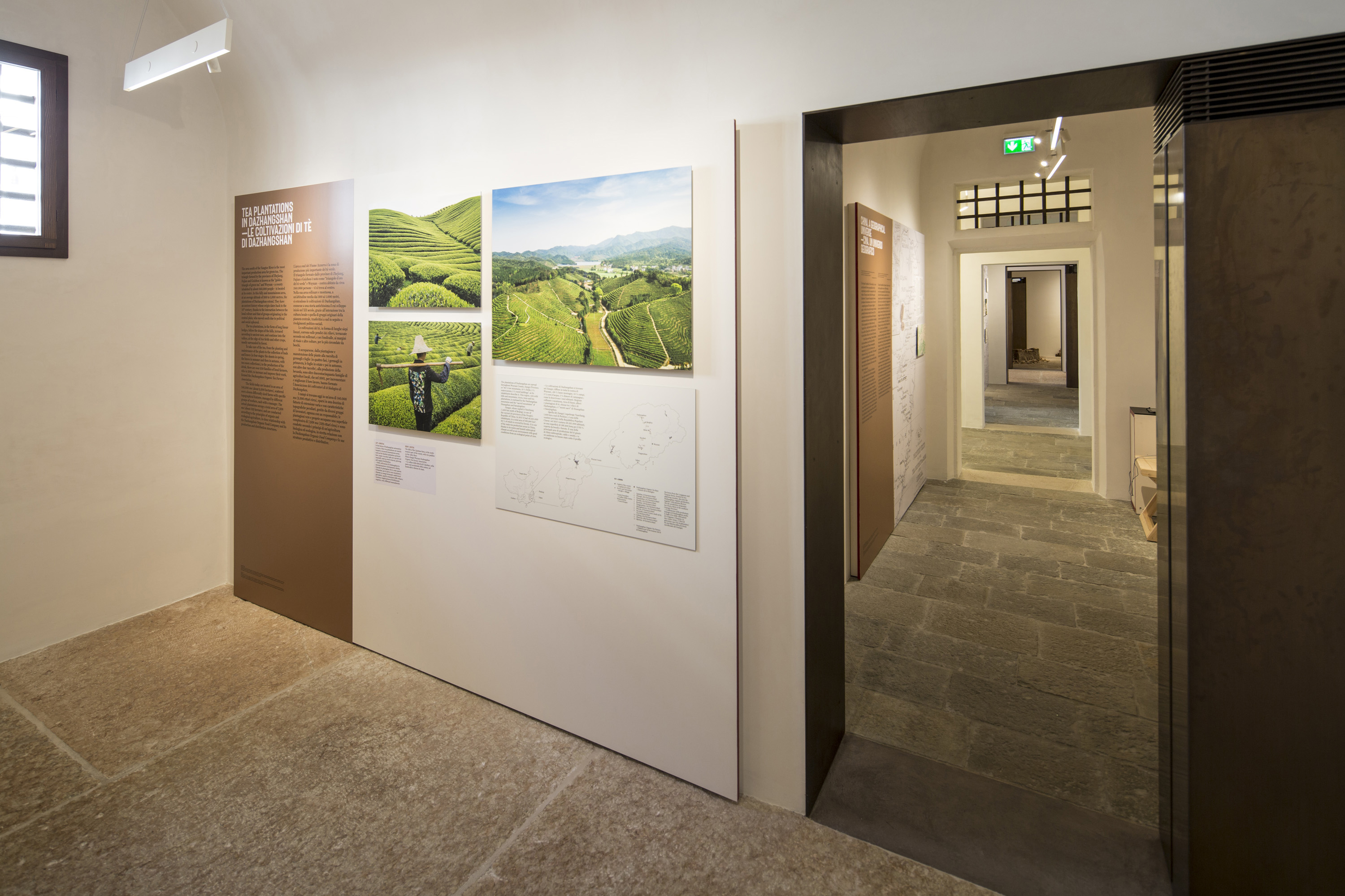

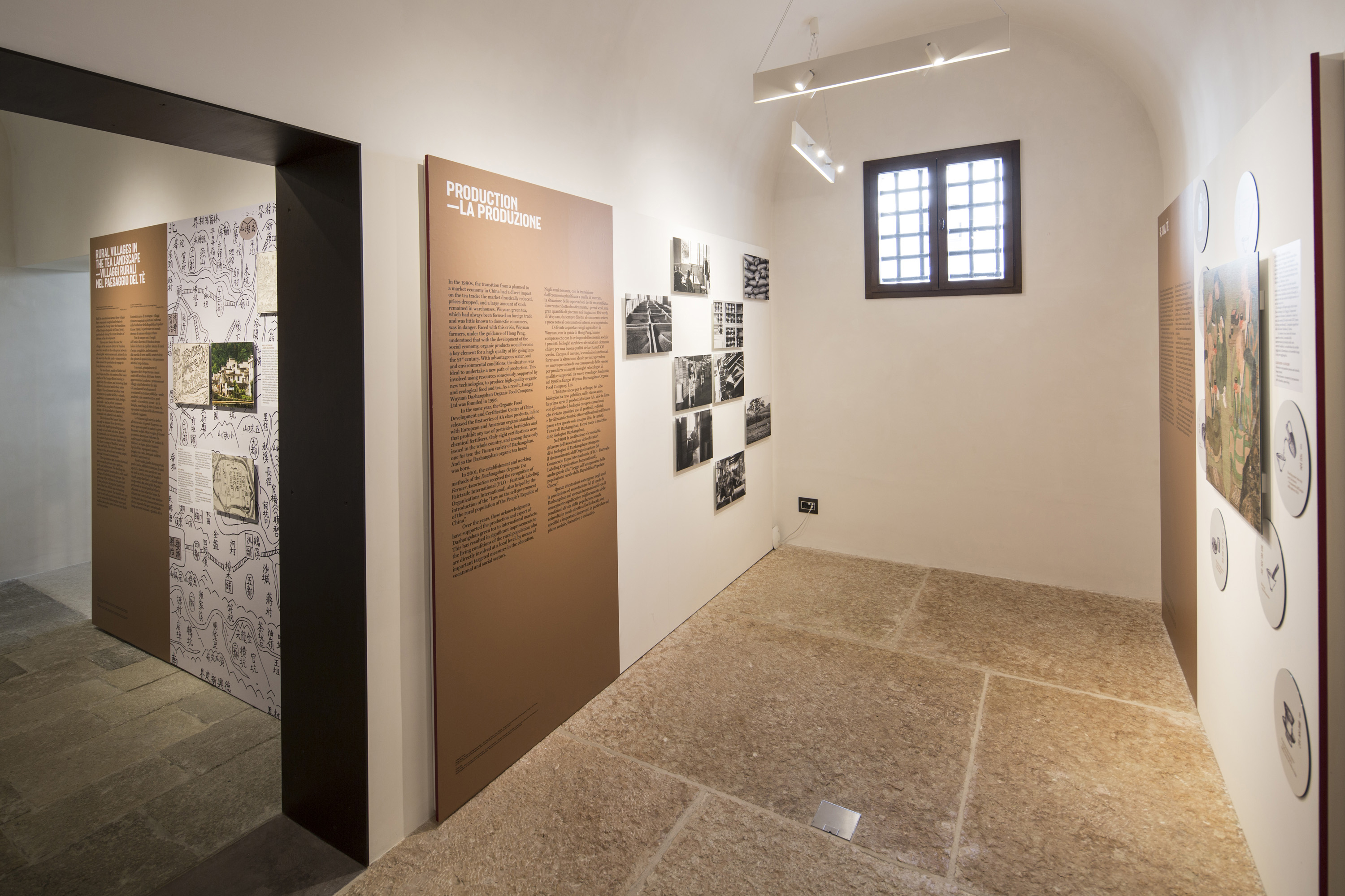
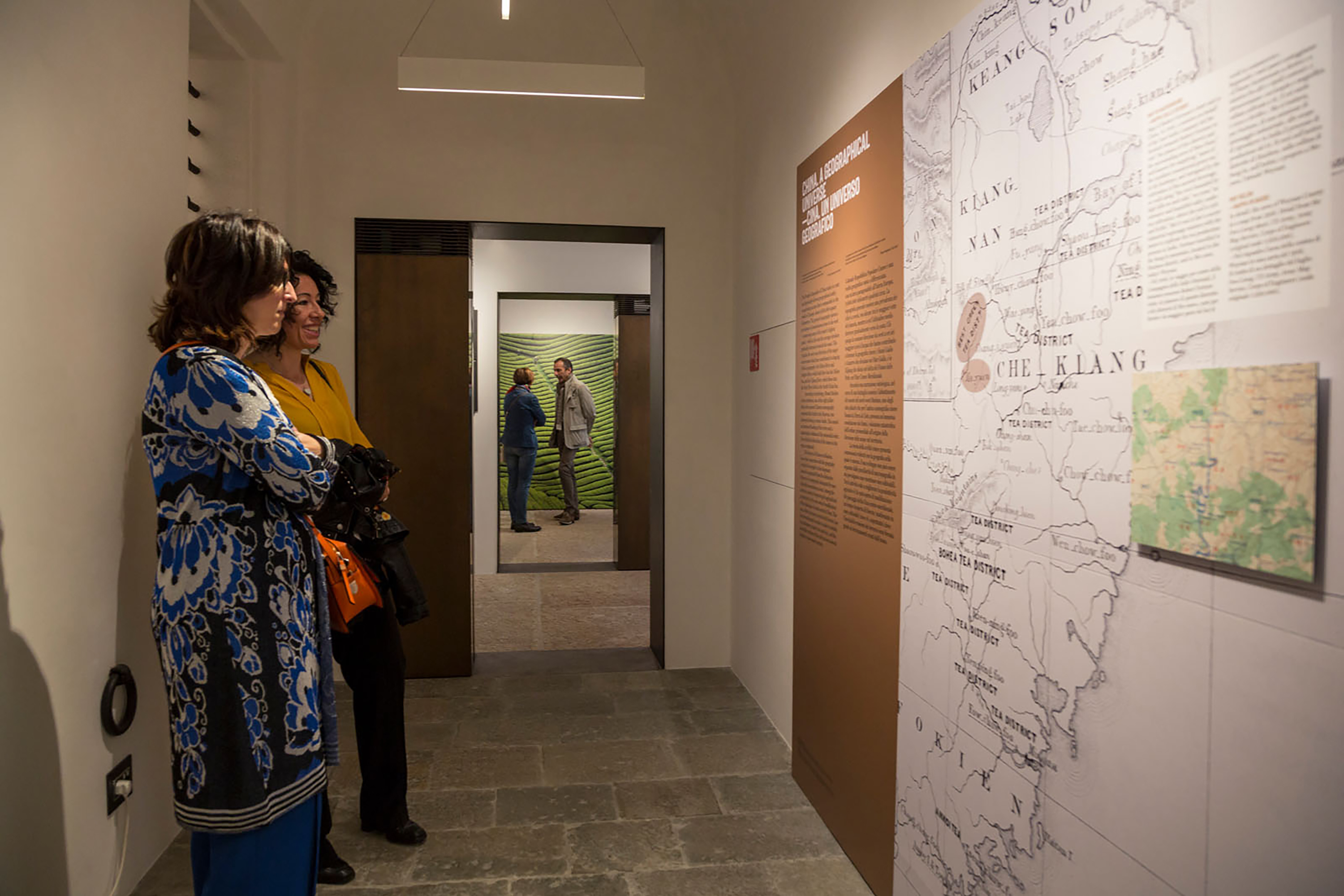
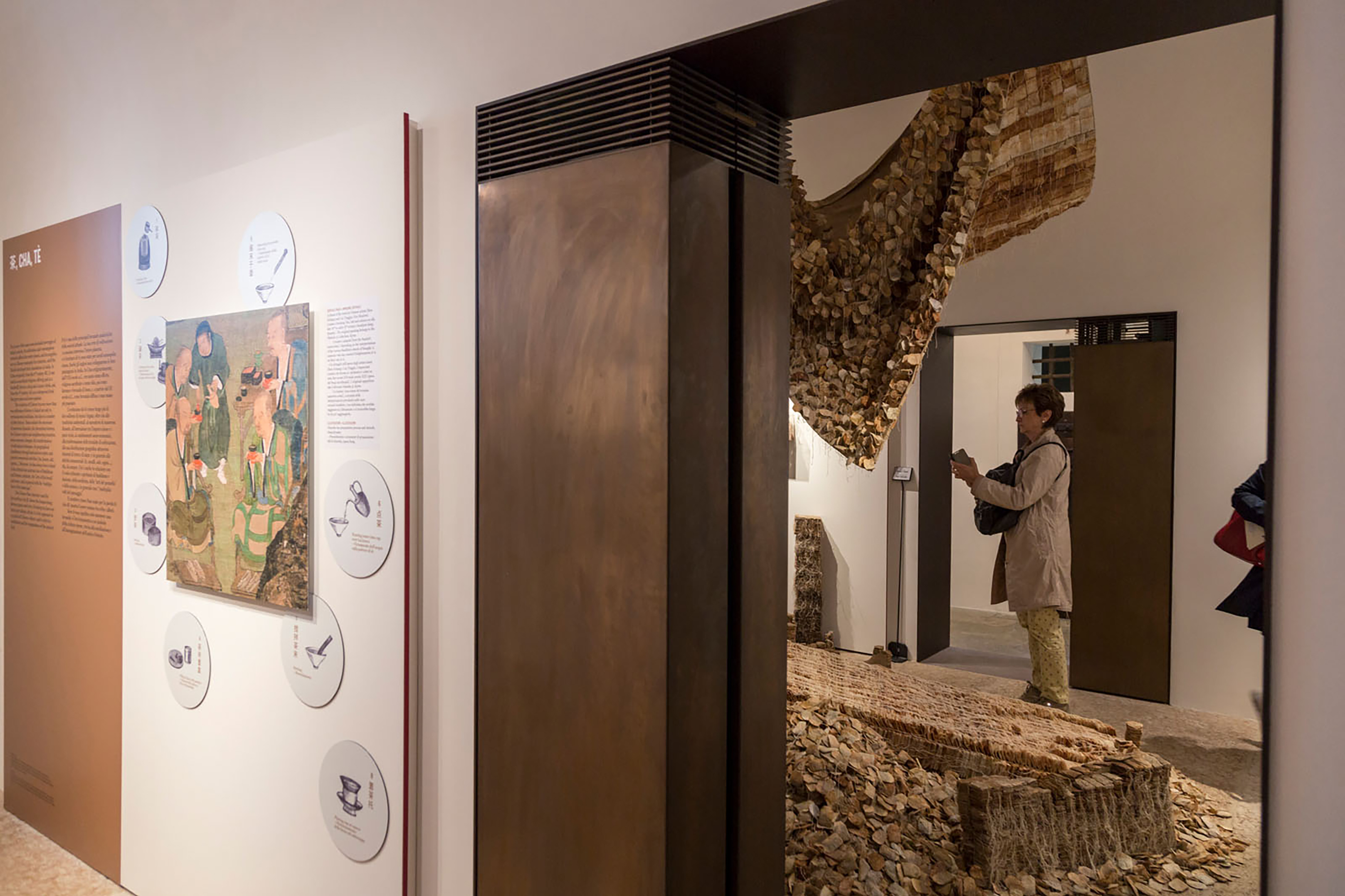


Presented together by Fondazione Benetton and Gallerie delle Prigioni, the exhibition The Ground We Have in Common celebrated the 30th edition of The International Carlo Scarpa Prize for Gardens, a campaign of studies for sites around the world which are particularly rich in natural, historical and creative values.
The exhibition composes of three parts: scientific research, 30 years retrospect of the award as well as contemporary art inspired by the awared garden in 2019. Information panels, maps, graphics for artist interview videos as well as social media are created to give the diverse range of content a unified look, together celebrating the awarded subject of the year: the tea garden in Dazhangshan, China.
Photos by Marco Pavan.
Hong Kong Shophouse


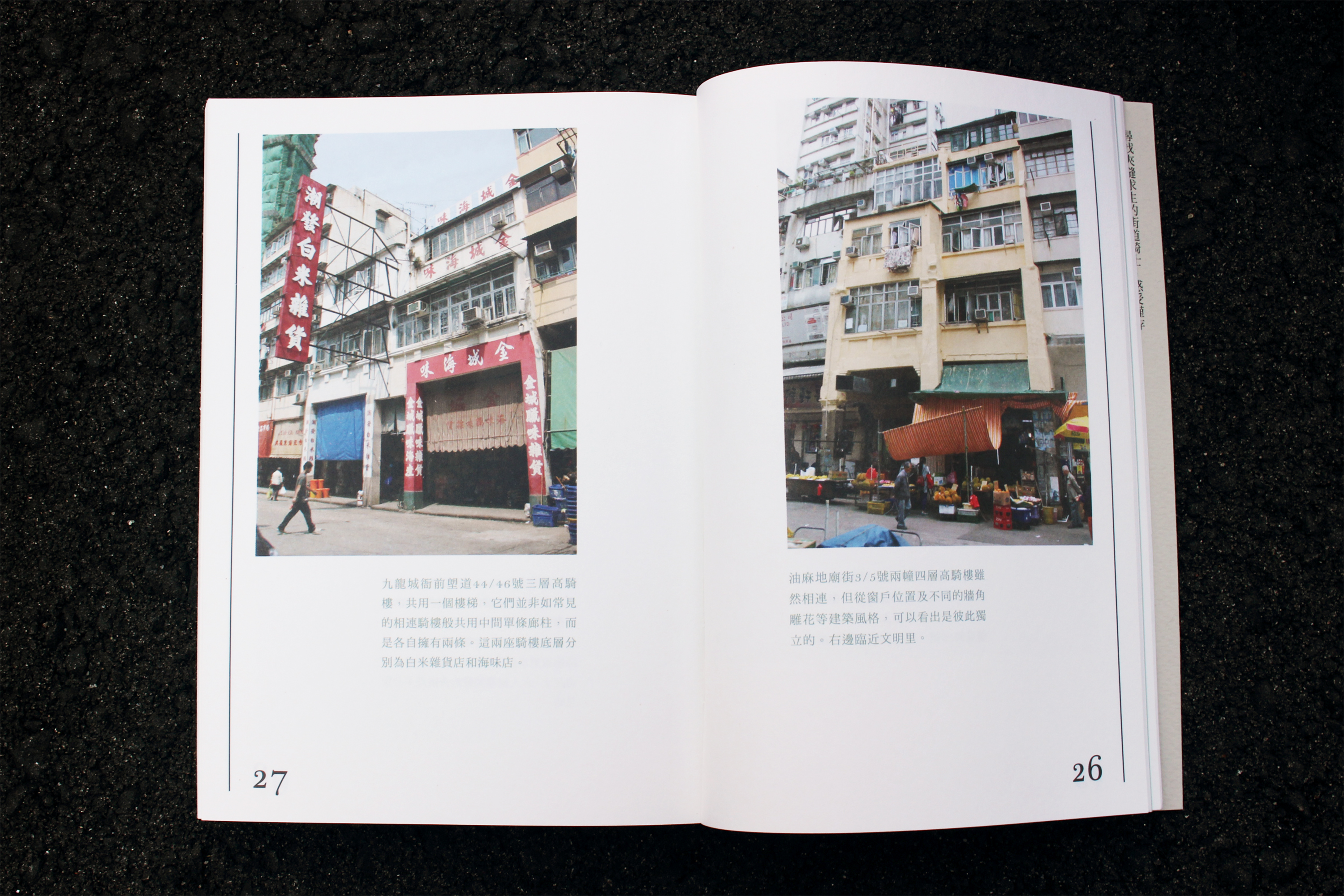


Hong Kong shophouse is a visual study of the remaing shophouses in the city, giving a brief introduction to its history, aesthetic elements and its relationship with the urban landscape.
Architectural characters are mimicked graphically as the typographic foundation both on the book cover and throughout the pages; a city map showing the distribution of the remaining structures is also created and attached at the back of the book.
Architectural characters are mimicked graphically as the typographic foundation both on the book cover and throughout the pages; a city map showing the distribution of the remaining structures is also created and attached at the back of the book.