Up to Now. Fabrica Photography


Up to Now. Fabrica Photography catalogs 20+ years of visual research created by photographers from around the world during their time in Fabrica, the communication research center of Benetton.
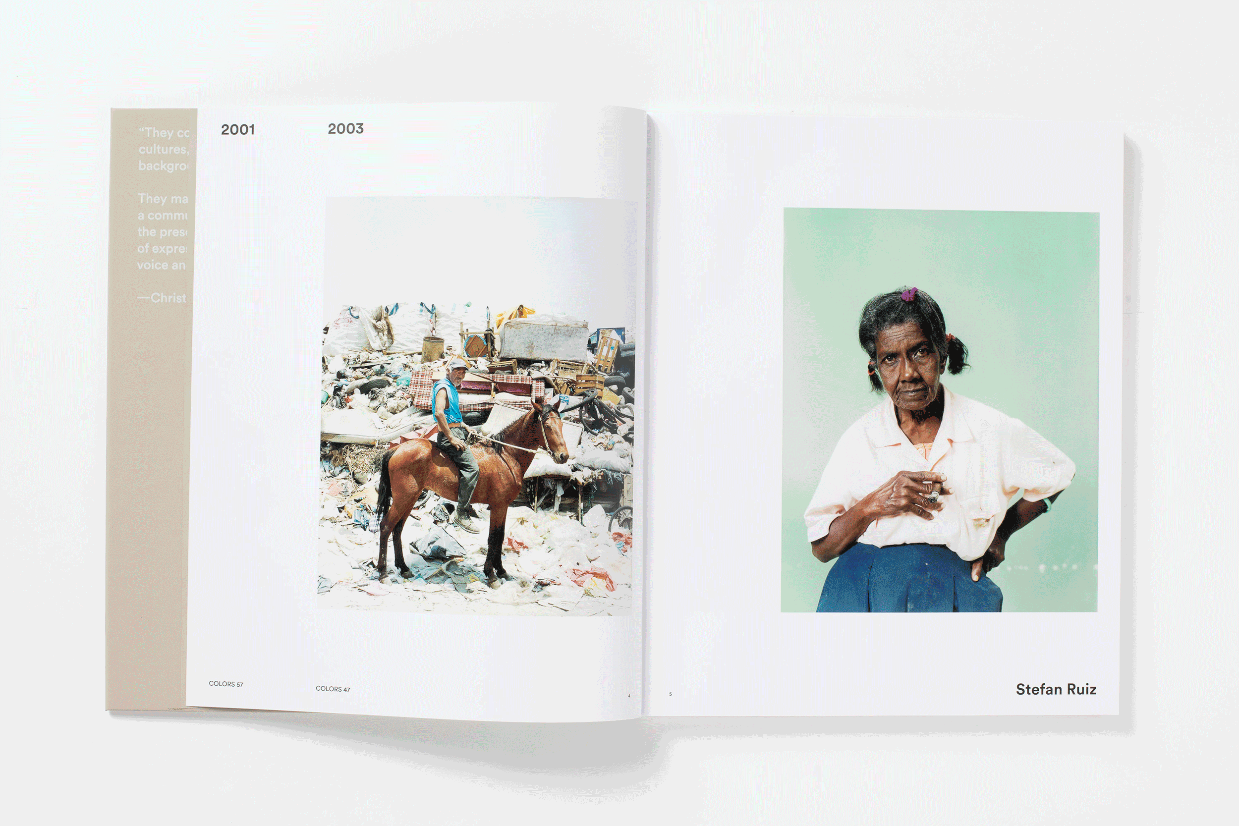
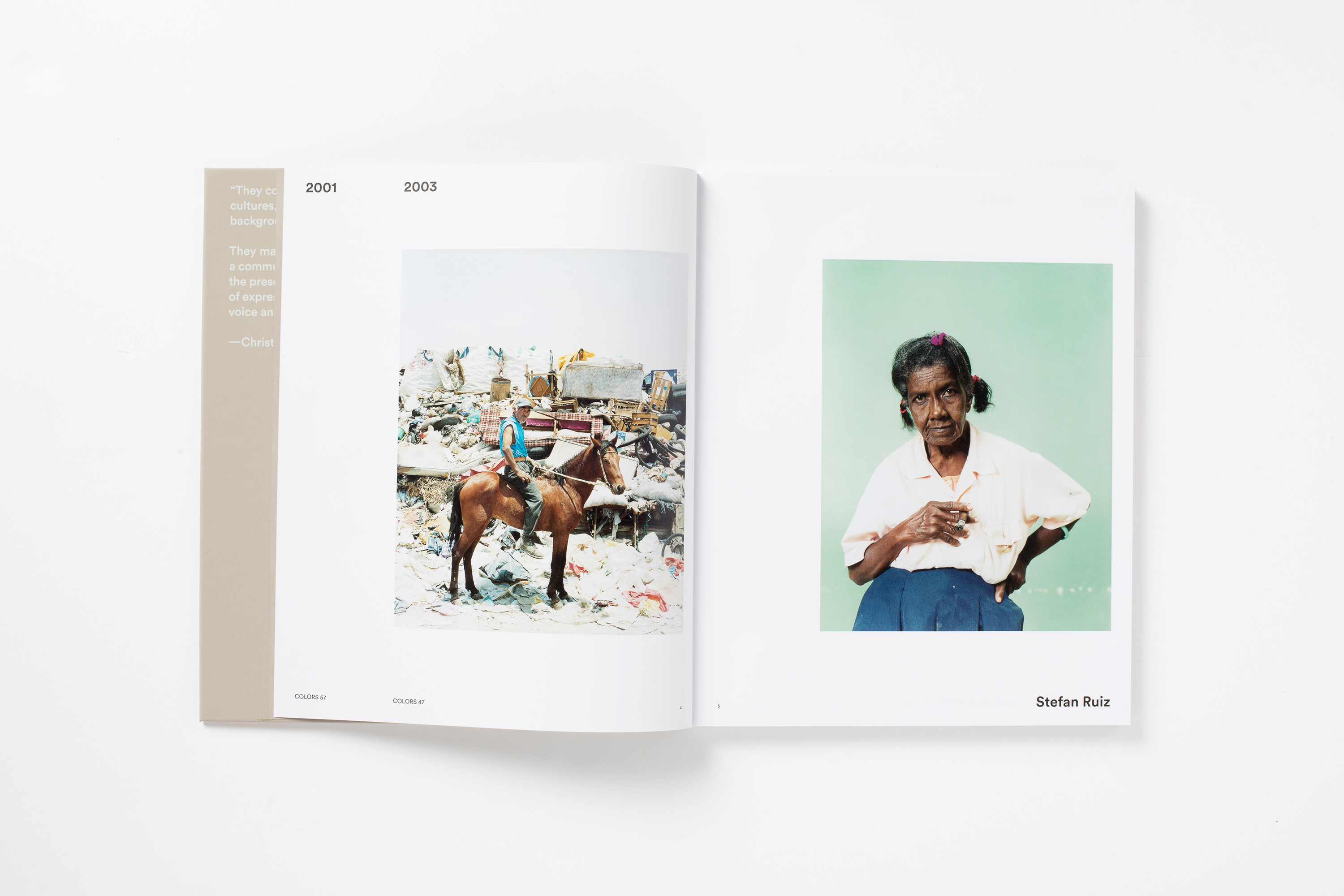
Guiding by a dynamic index on the top margin of the book, the catalog delivers a chronological overview of the diversity and change of topics and artistic approaches among the generations of photographer.
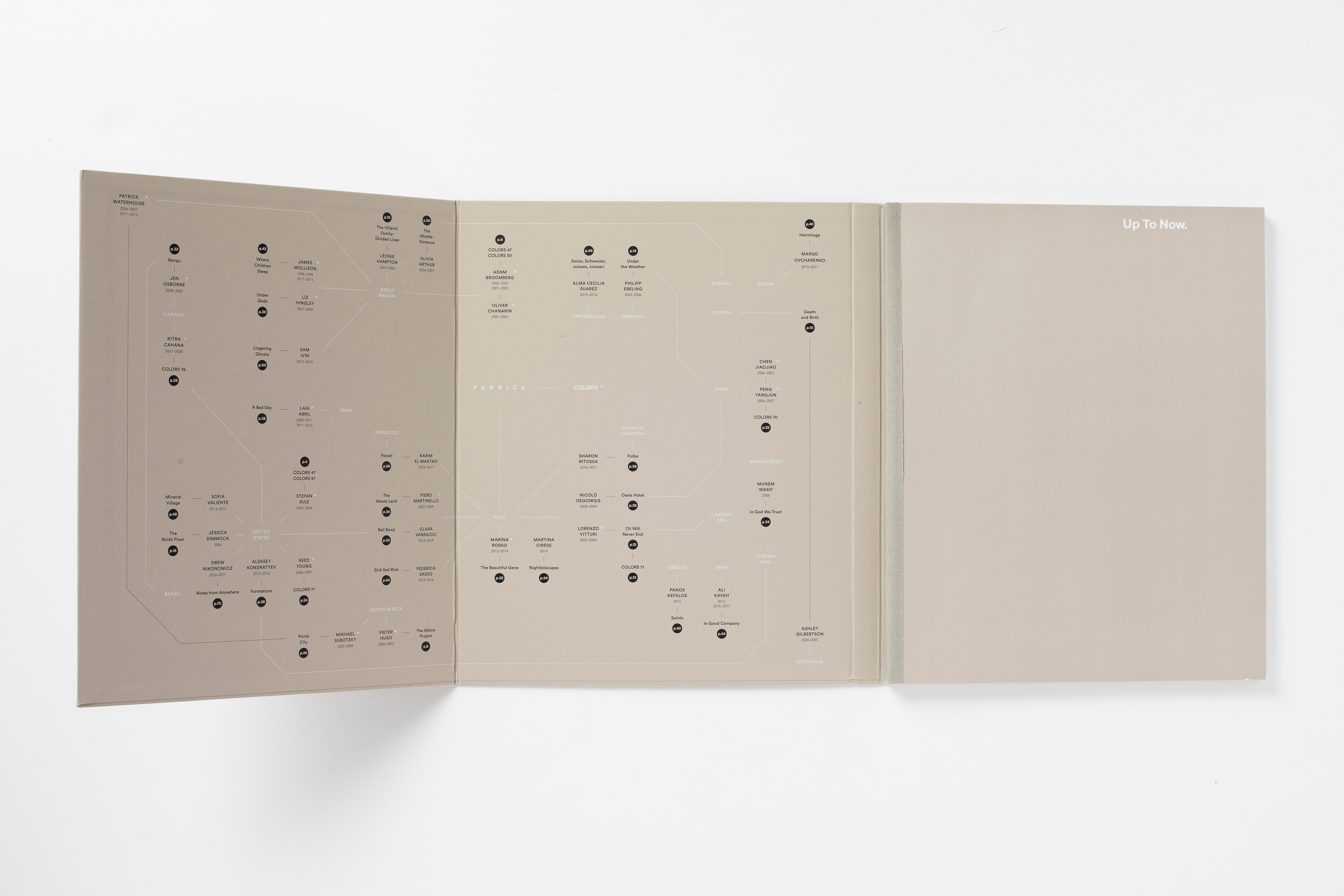
Right behind the cover, a geographic index suggests another way to view the projects. By mapping up photographers, projects and countries, it portraits not only the history of Fabrica being an incubation hub for international talents, but also the global network—visually, culturally and interpersonally—formed by the creatives and their projects.
You can now get a copy on Fabrica store. Photos by Marco Zanin.
Guiding by a dynamic index on the top margin of the book, the catalog delivers a chronological overview of the diversity and change of topics and artistic approaches among the generations of photographer.
Right behind the cover, a geographic index suggests another way to view the projects. By mapping up photographers, projects and countries, it portraits not only the history of Fabrica being an incubation hub for international talents, but also the global network—visually, culturally and interpersonally—formed by the creatives and their projects.
You can now get a copy on Fabrica store. Photos by Marco Zanin.
Novel of Lau Yeewa


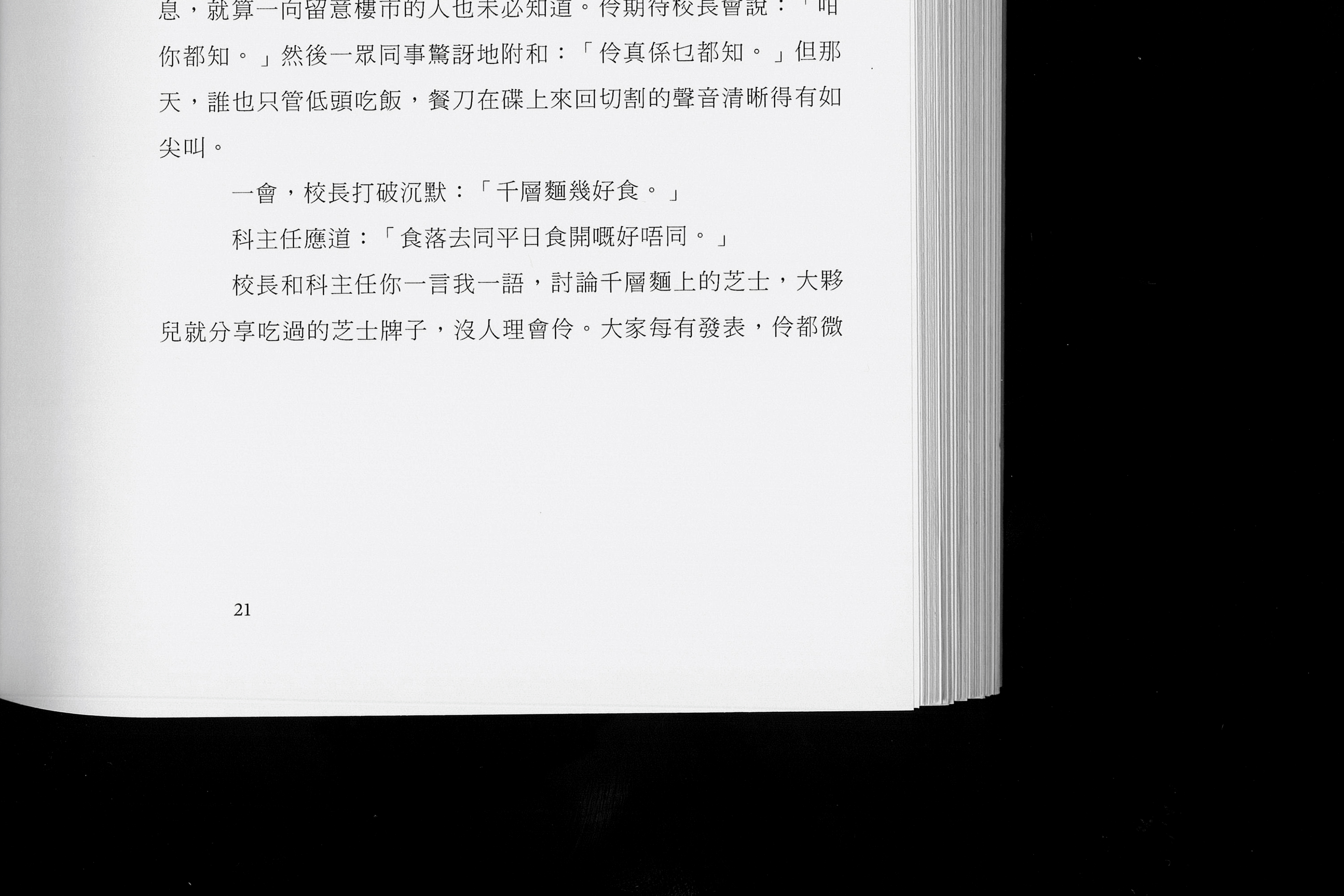

Lost words, published by Wheat Publishing, is the
first noval of Lau Yeewa, an emerging writer in Hong Kong.
The book cover consists of six mirrors to recreates one of the symbolic scene in the story; the page numbers on the second chapter is typsetted in romanized Mandarin (pinyin) instead of conventional arabic numbers, resonating Lau’s increasing emphasis on the language the protagonists use.
You can read the interview of the author and the book here, and one of the book review here.
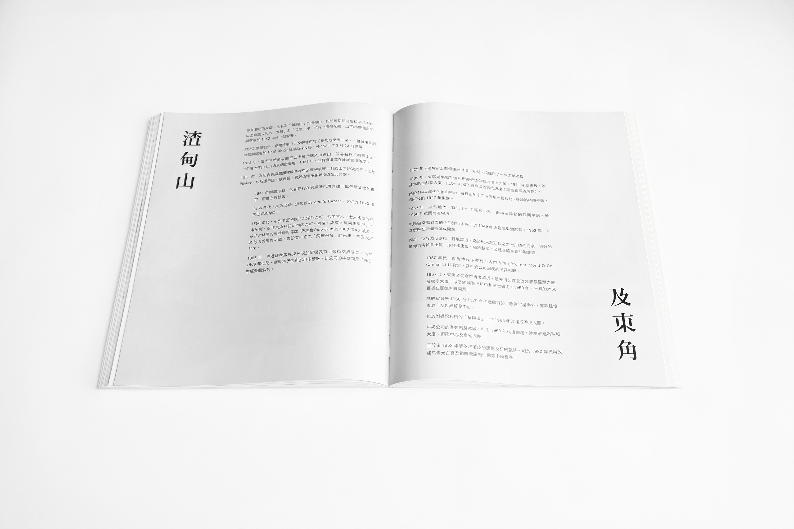
Hong Kong Shophouse


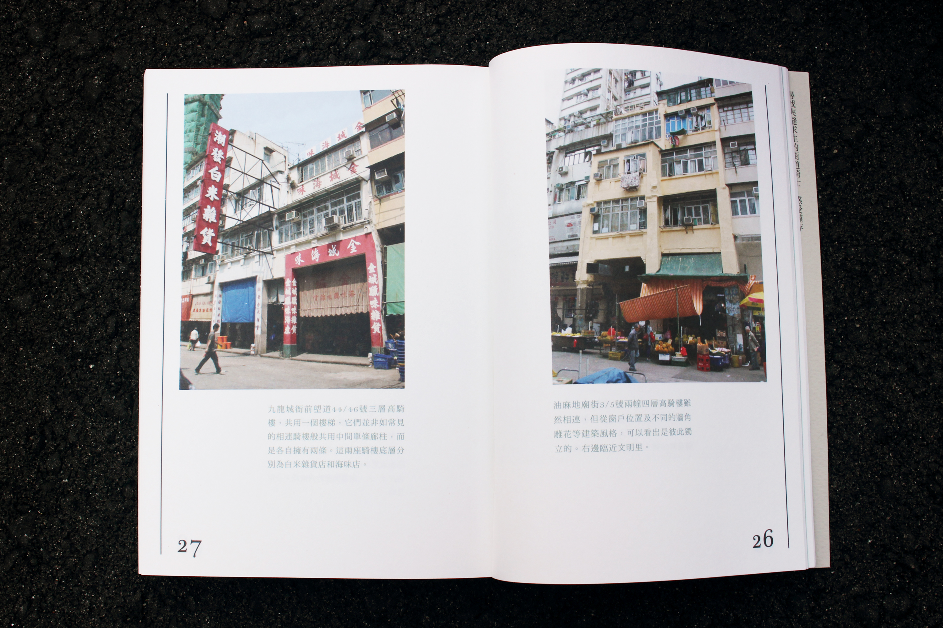


Hong Kong shophouse is a visual study of the remaing shophouses in the city, giving a brief introduction to its history, aesthetic elements and its relationship with the urban landscape.
Architectural characters are mimicked graphically as the typographic foundation both on the book cover and throughout the pages; a city map showing the distribution of the remaining structures is also created and attached at the back of the book.
Architectural characters are mimicked graphically as the typographic foundation both on the book cover and throughout the pages; a city map showing the distribution of the remaining structures is also created and attached at the back of the book.
Hong Kong: The past and the present
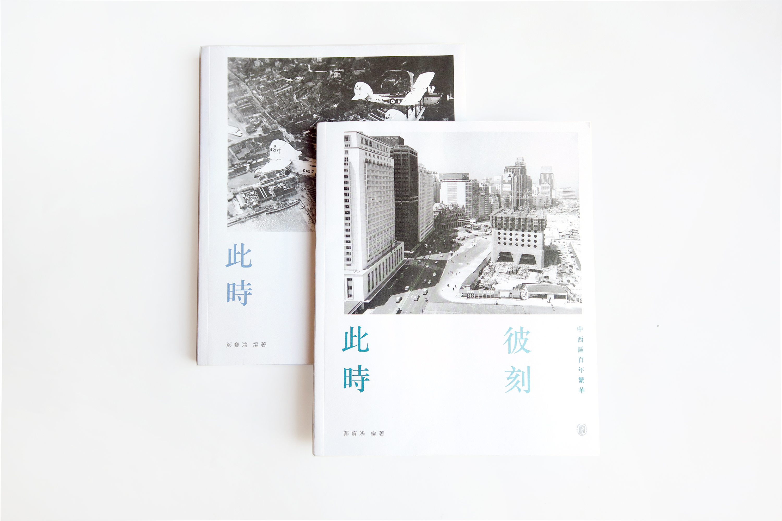


Past and Present is a photobook series that showcases historical photographs of Hong Kong’s city landscape, with photographs of present days alongside for comparison.
Chinese lettering: on variant characters

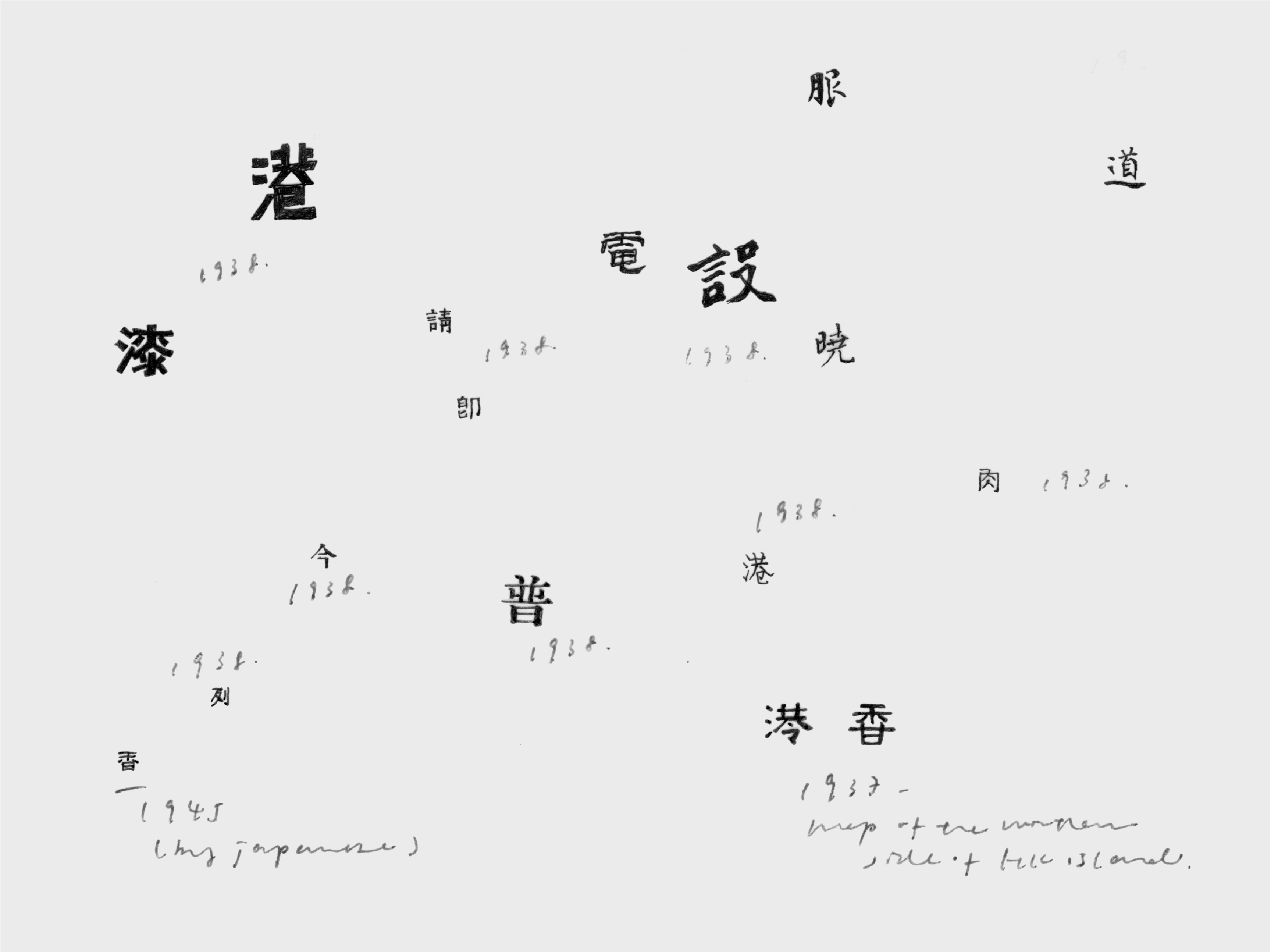


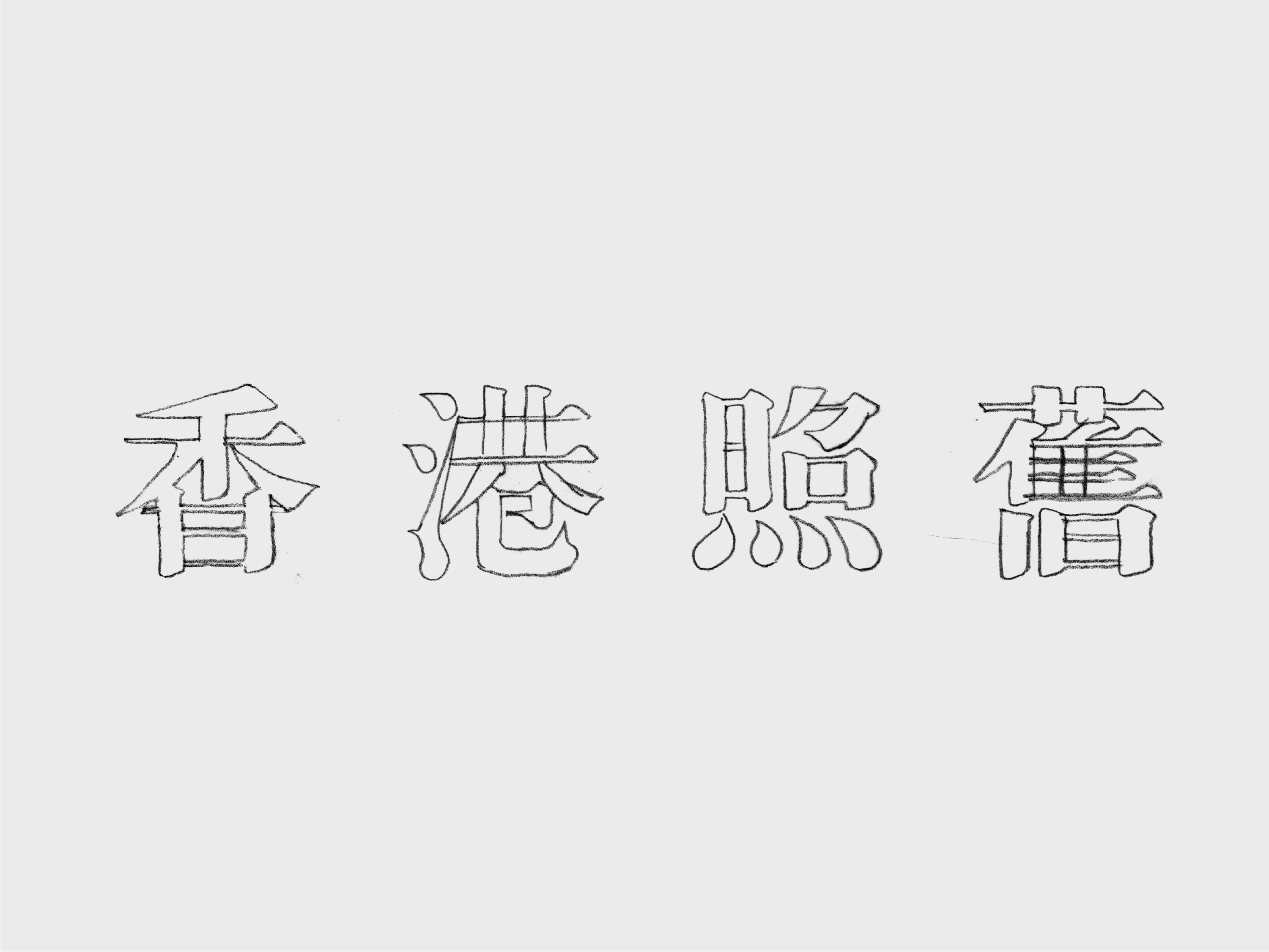
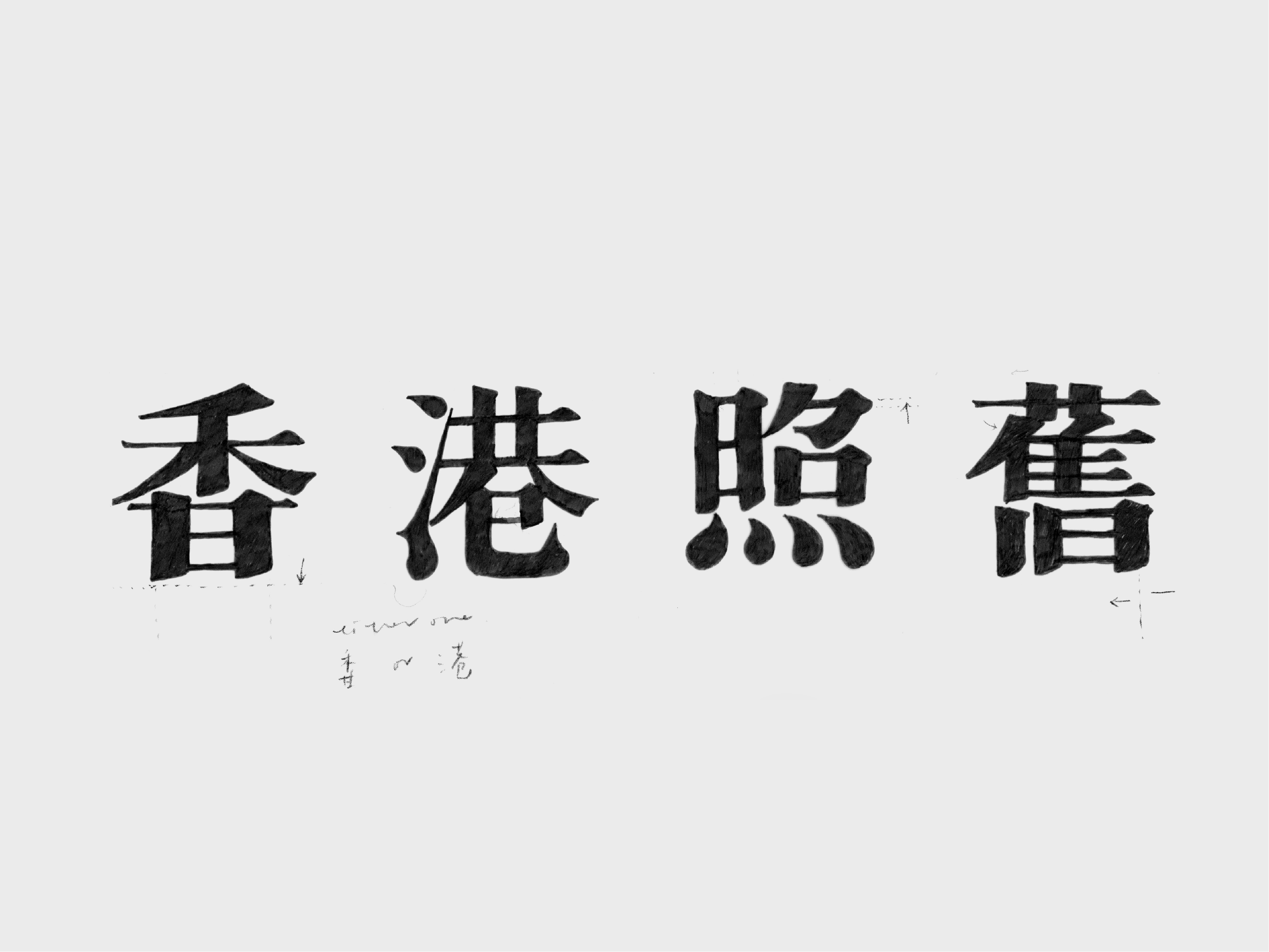


A custom Chinese logotype for the cover of photo book The Old Hong Kong. It adopts the writing customs and typographic aesthetics of traditional Chinese variant characters prevailed in the urban landscape in the early 20th Century.